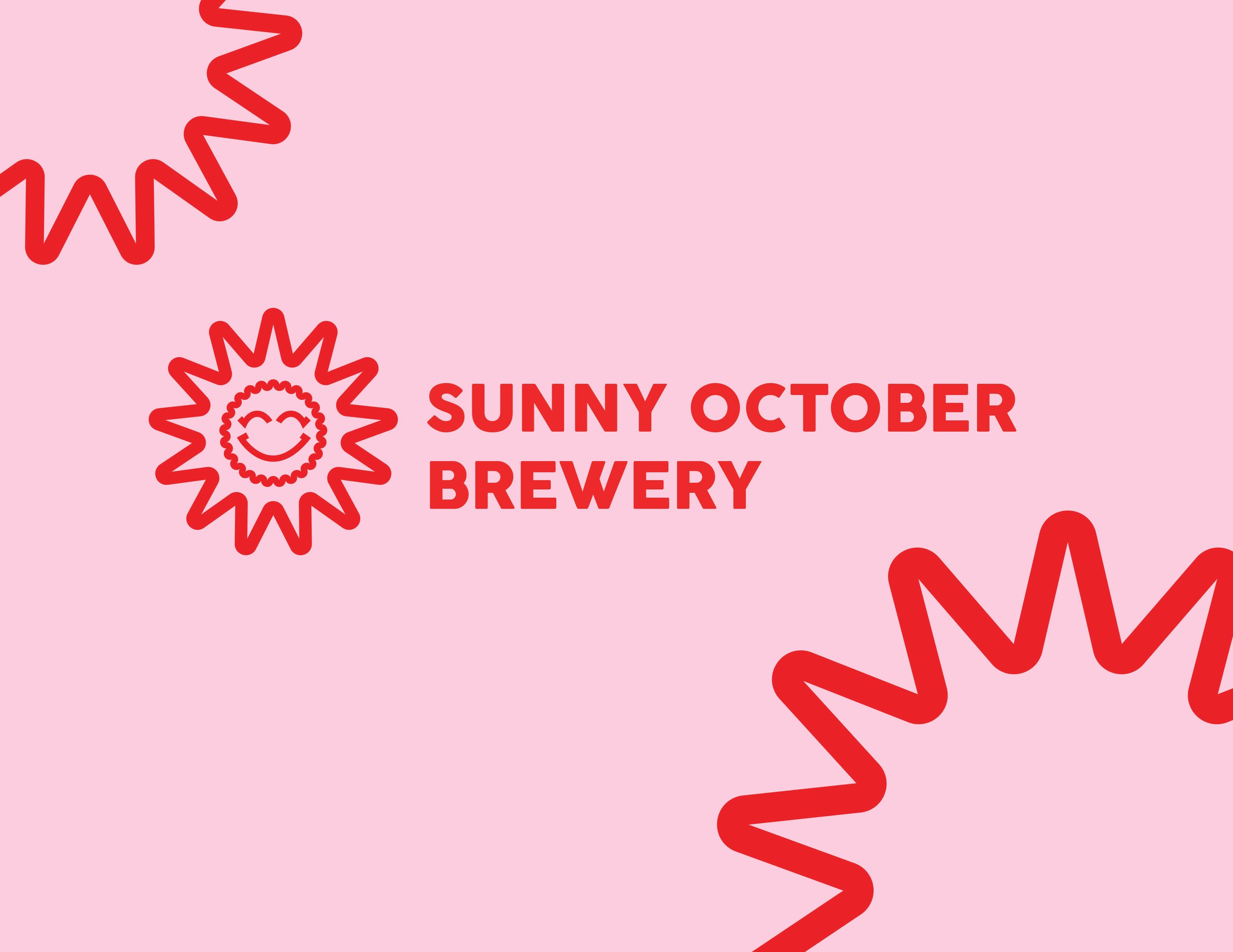
Client: Sunny October Brewery
-
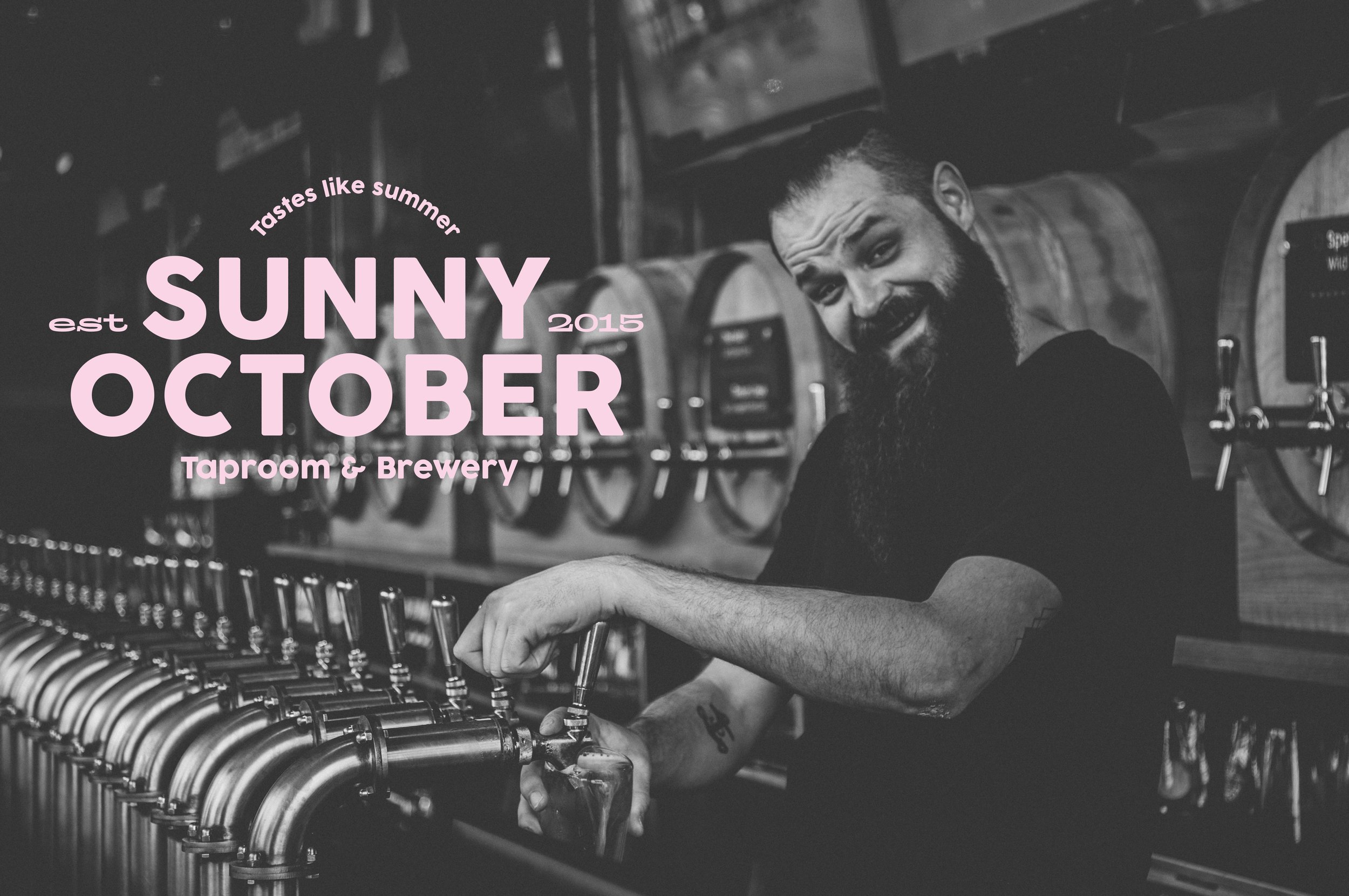
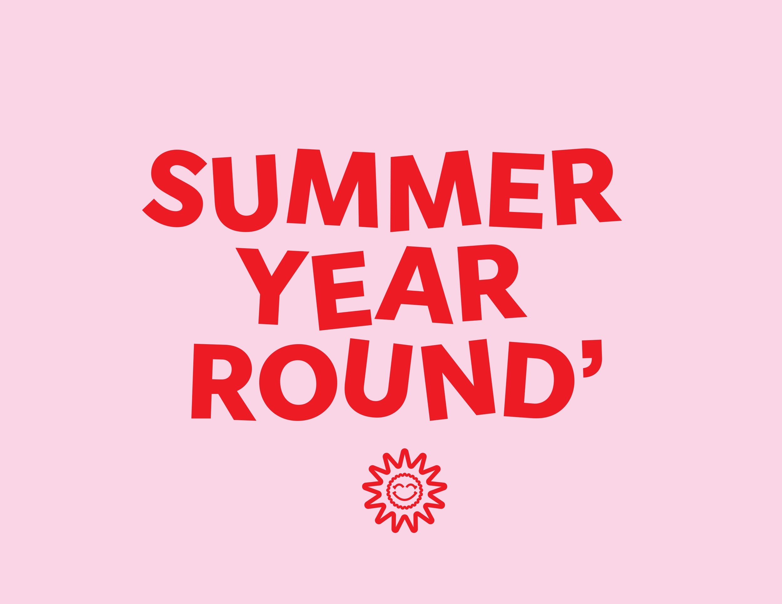
Logo Design
-
Sunny October is a brewery and taproom specializing in craft beer and good times. They needed a fun logo to give themselves an identity that stands out!
-
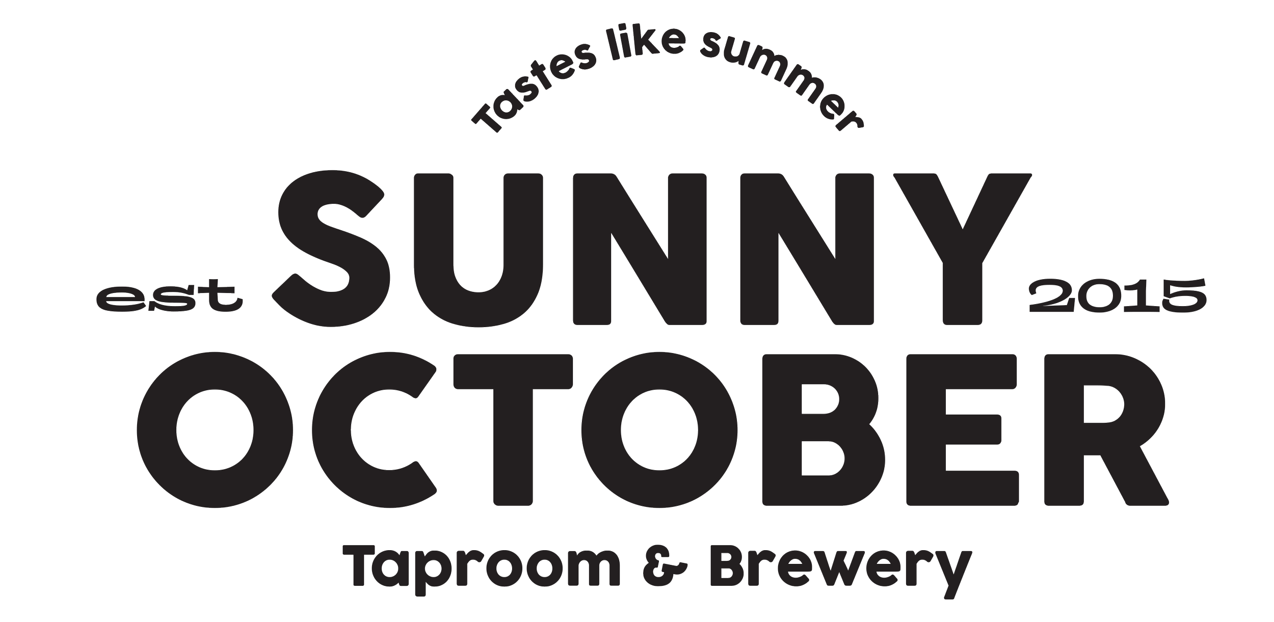
The goal was to create a logo suite that would stand out in a saturated brewery market. I aimed for a design that clearly communicated their name while incorporating a subtle, versatile mark that could be adapted across various applications.

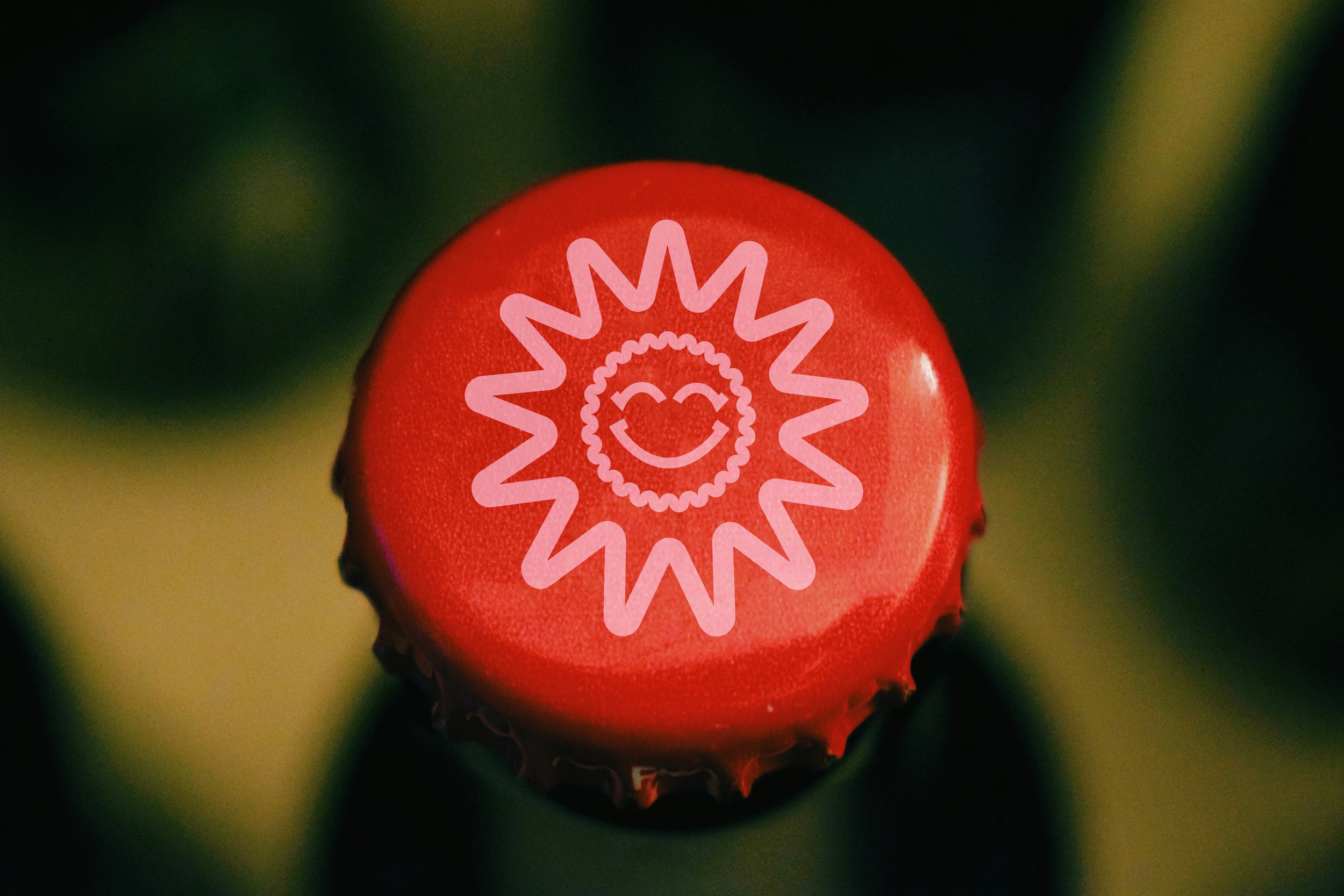
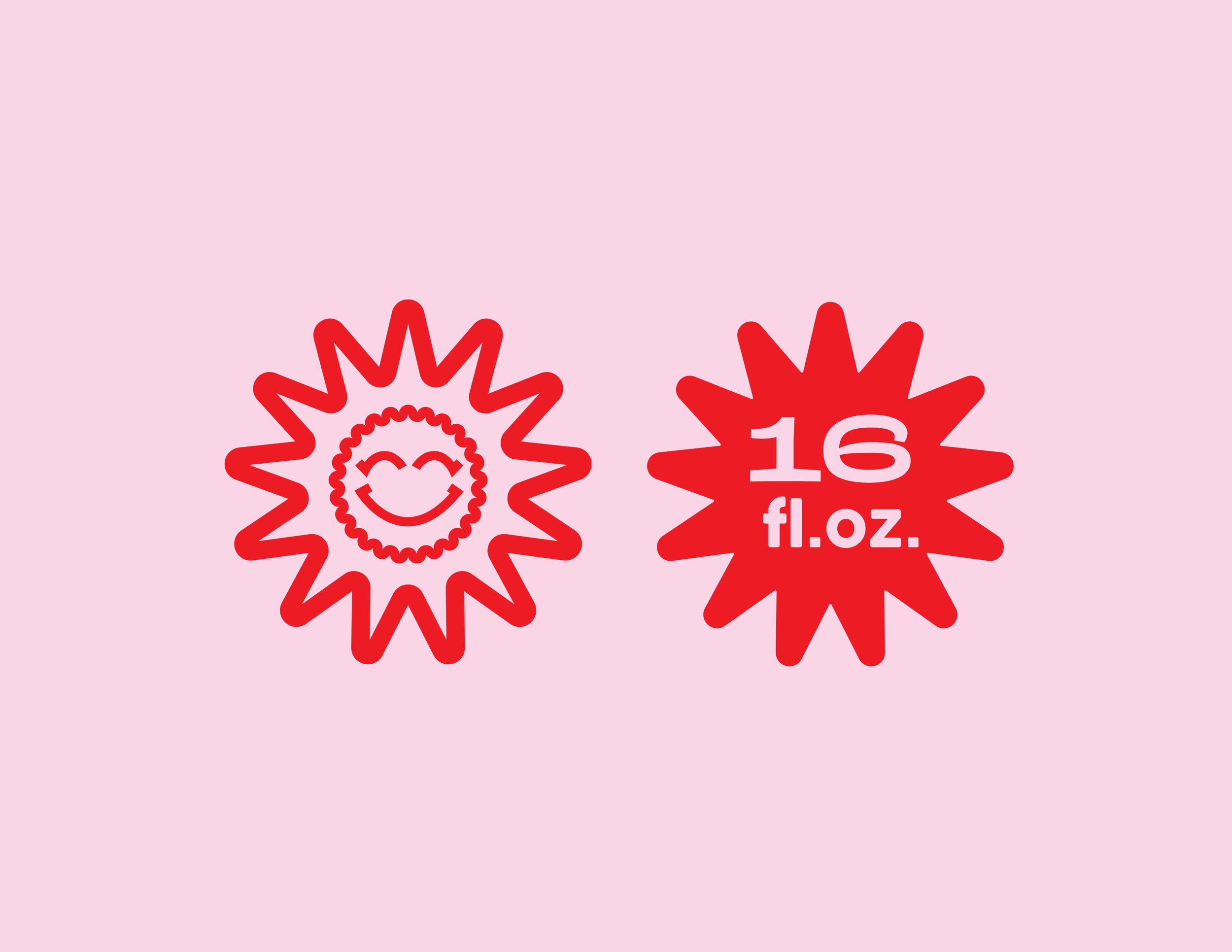
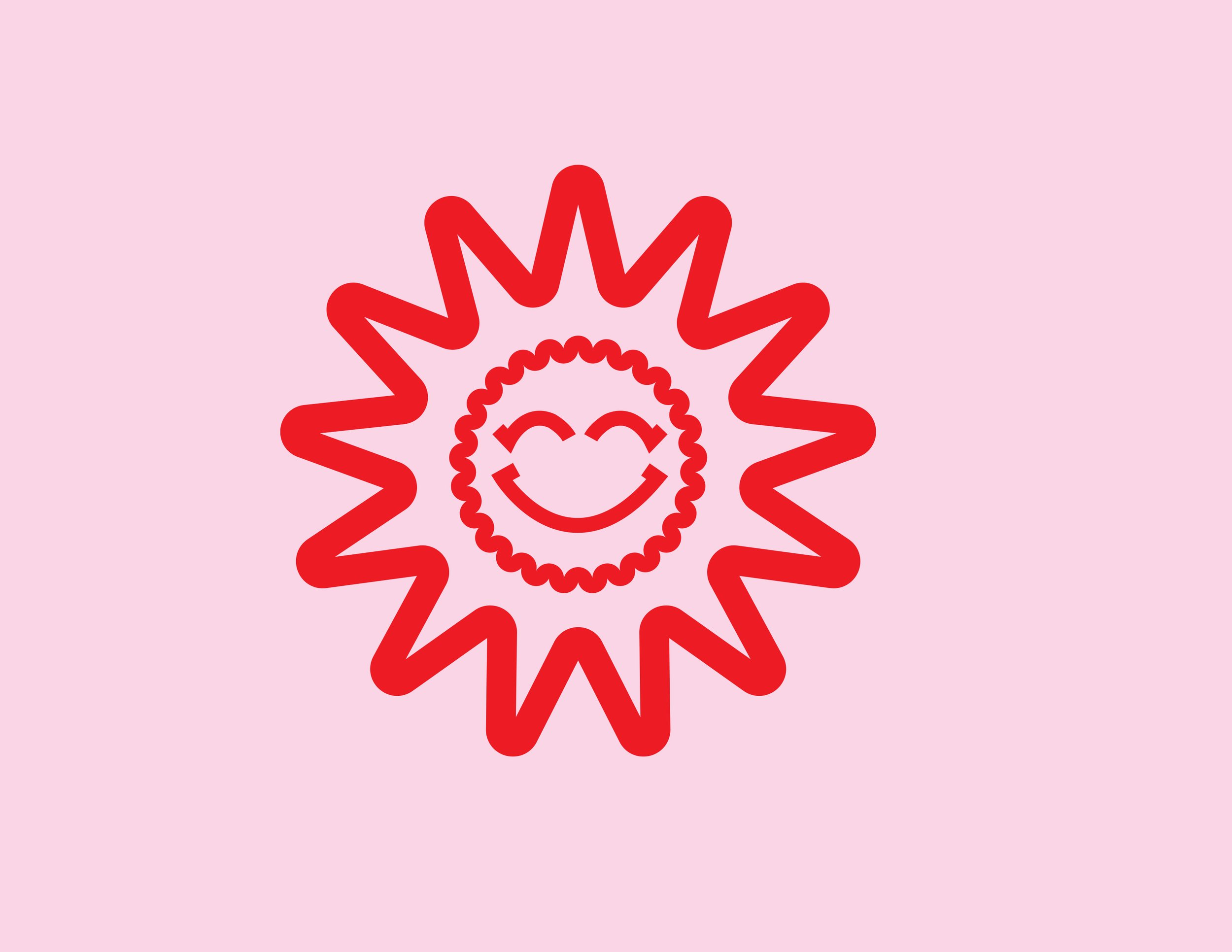
The Mark
This logo mark for Sunny October Brewery captures the playful, laid-back spirit of the brand by blending two instantly recognizable symbols: the sun and a bottle cap. The outer jagged rays evoke a bright, warm October sun, while the smiling face at the center is framed by the distinct ridges of a beer bottle cap—subtly tying in the brewery’s core product. With its clean, bold lines and cheerful expression, the mark feels both modern and nostalgic, reflecting a brand that values good beer, good weather, and good vibes. It’s simple, memorable, and perfect for merch, cans, and tap handles alike.


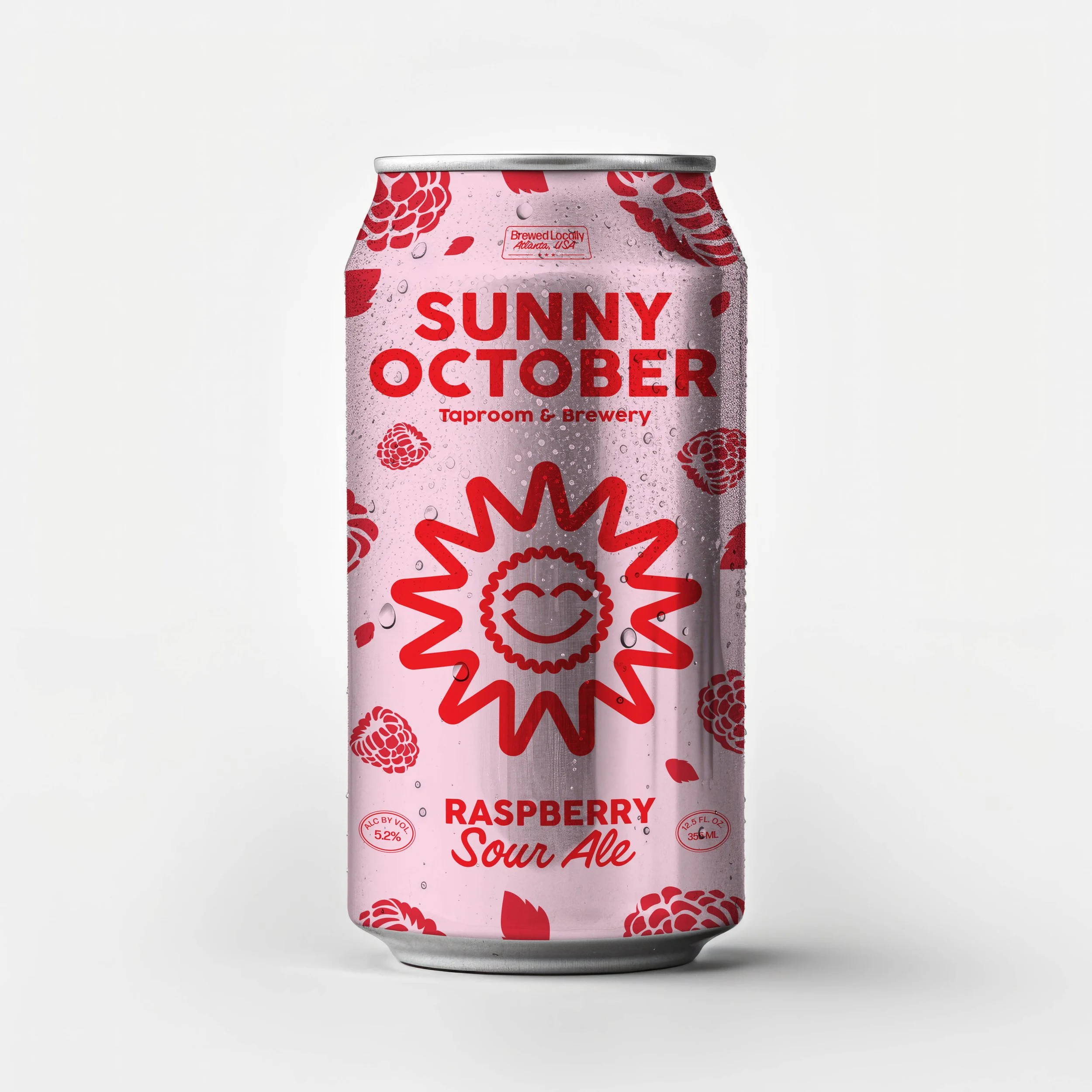
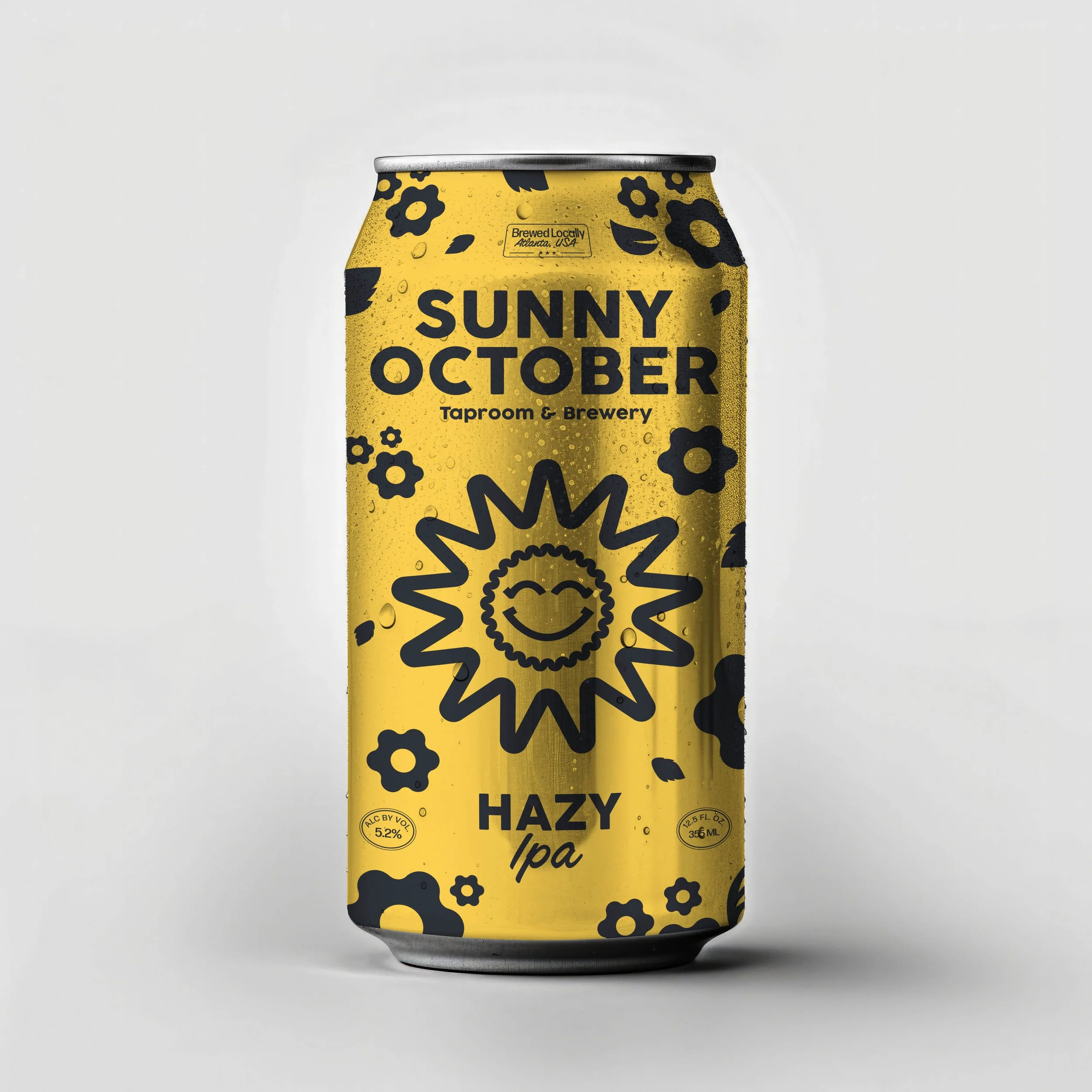
Packaging
For the packaging, I really wanted each can to feel fun, warm, and super approachable—just like the name Sunny October sounds. I started by making the sun-and-bottle-cap face the main focus, since it feels both playful and iconic. From there, each flavor got its own vibe with color and ingredient patterns that match the beer style—like raspberries for the sour ale and hops for the classic pale. I leaned into bold, simple shapes so the cans would stand out but still feel cohesive as a set. The typography has a retro, almost handwritten touch to keep it friendly and nostalgic. Overall, I was trying to capture that golden-hour feeling of fall—laid back, a little nostalgic, and something you'd want to crack open after a long day.