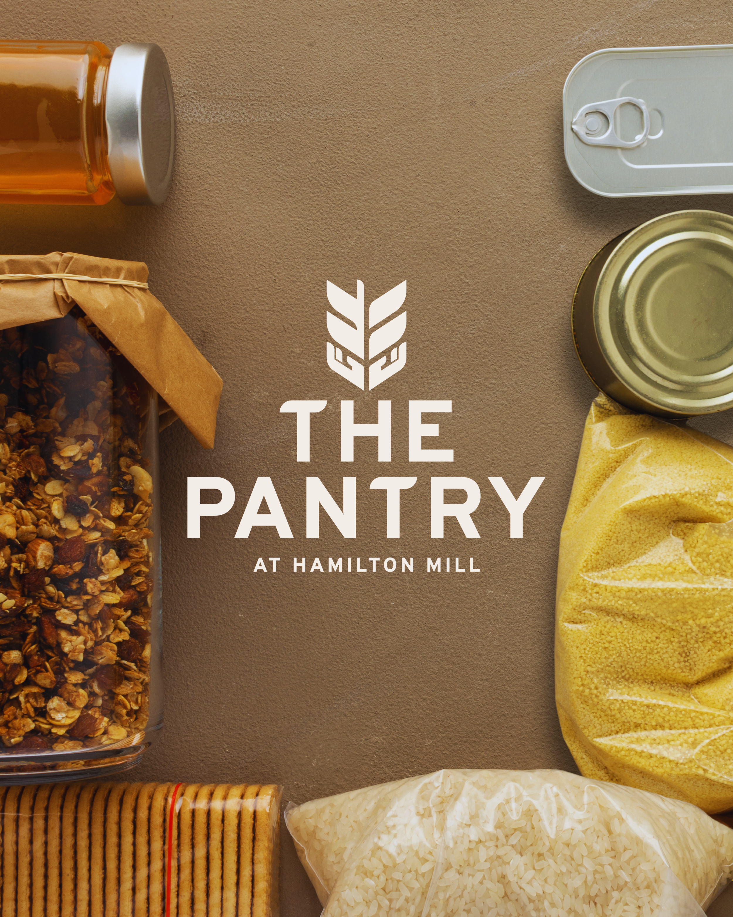
Client: The Pantry at Hamilton Mill
-
Logo Design
-
The Pantry at Hamilton Mill reached out to me to refresh their logo. They wanted something to better reflect the heart behind their service and adaptable to be used in multiple touchpoints.
-
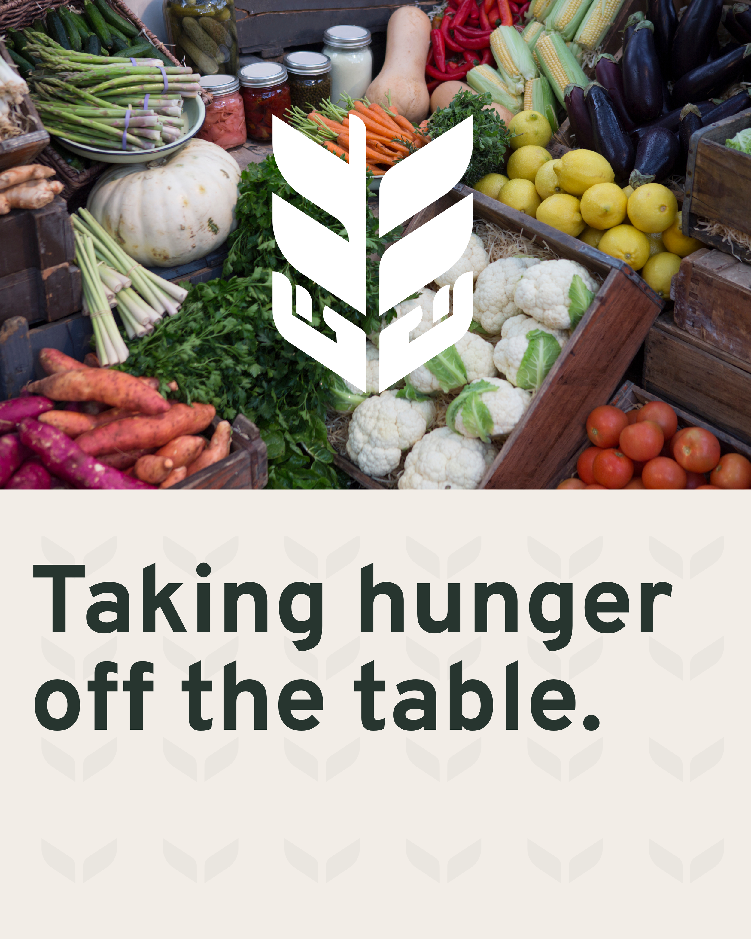
The goal was to create a logo that brings the pantry into the modern day while conveying the pantry’s connection to the community, its goal to provide the “bread of life” to all in need, and its acceptance to all who need service.


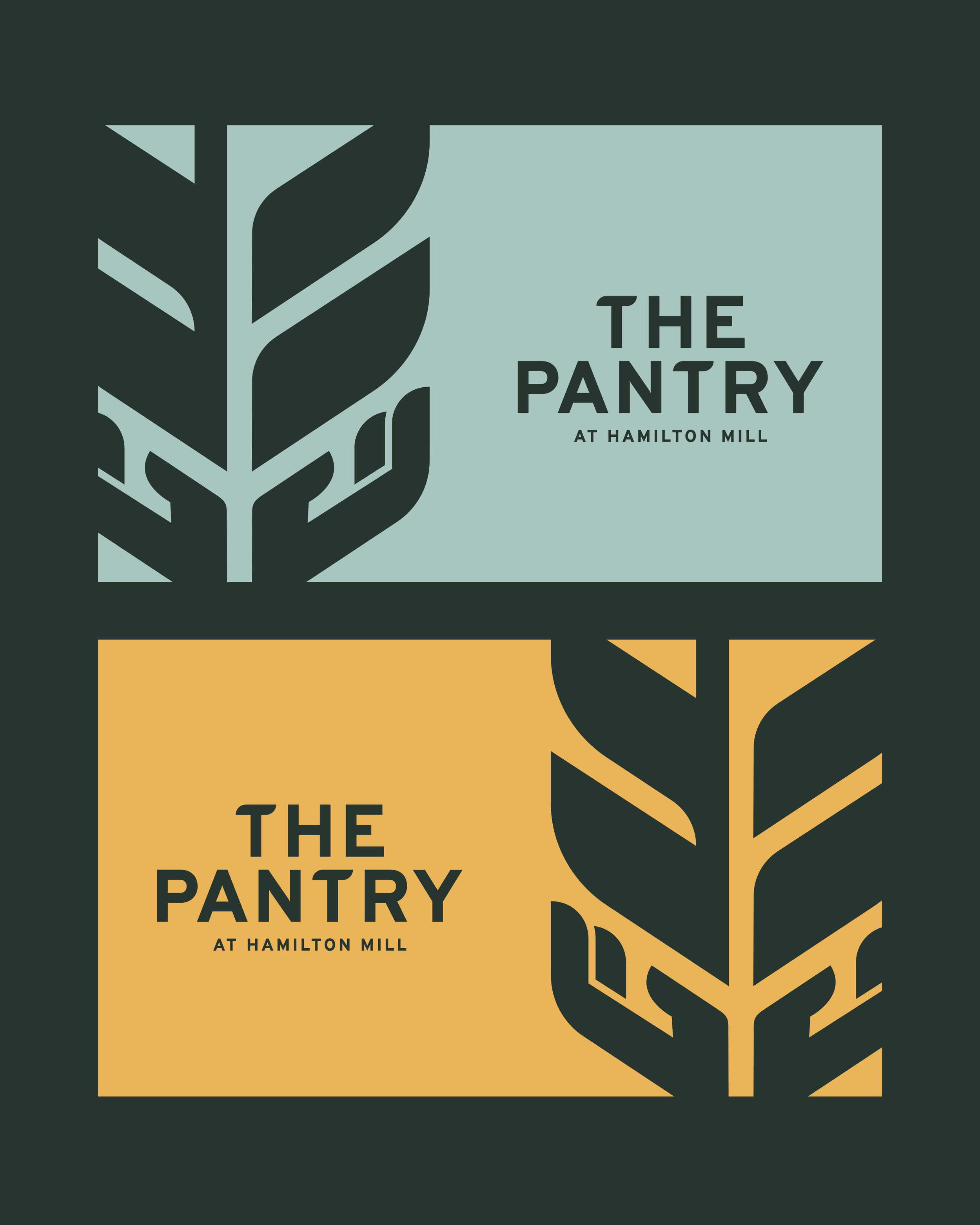
This logo mark conveys the Pantrys Ultimate Mission, which is to offer “The Bread of Life” to the People they serve. A simple grain of wheat with the bottom forming 2 hands to represent the Pantrys aceptance to all who need food, their lifting up of others, and their goal to be the ”Hands and Feet” of Christ.
The Mark


Sketching
Every logo begins in the sketchbook. My goal was to capture their mission—the “bread of life”—while weaving in themes of acceptance, warmth, and being “the hands and feet of God.” Each sketch refined the idea, ultimately leading to a design where a grain of wheat seamlessly merges with open, welcoming hands.