Client: Zone X Fitness
-
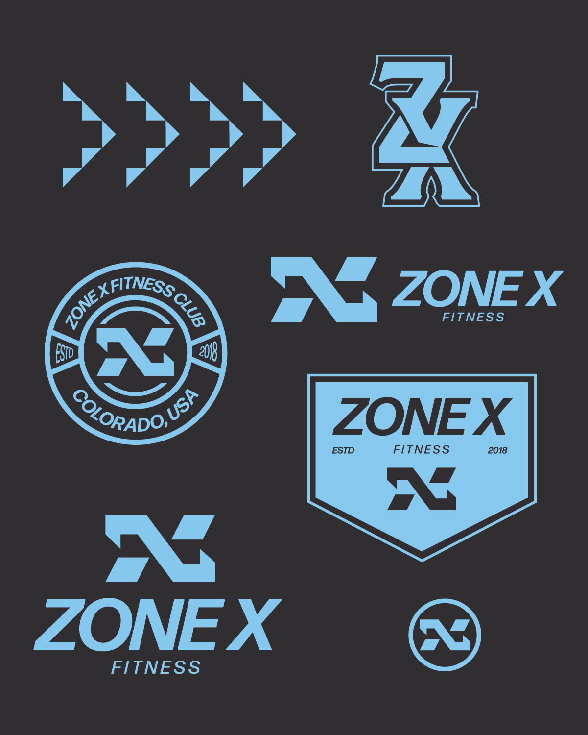
Logo Design
-
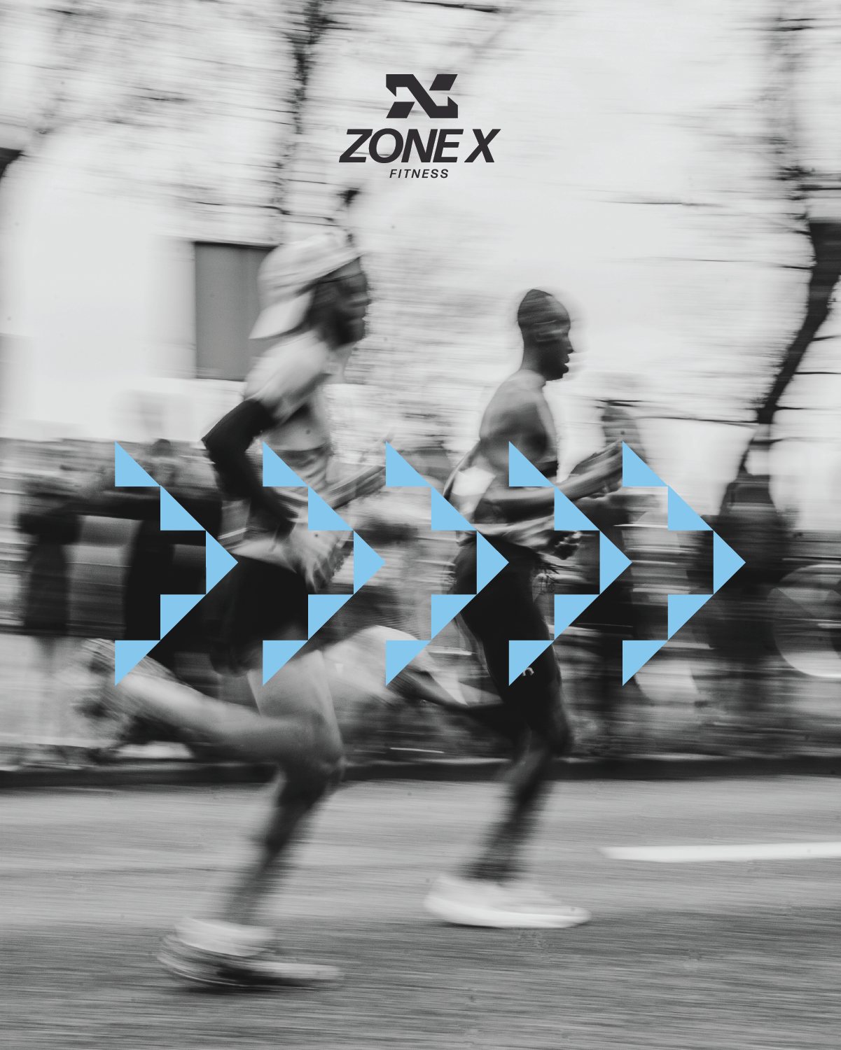
Zone X is a high-intensity fitness brand built around the ideas of speed, sharpness, and perpetual movement.
-
The goal of this project was to visually express the brand’s core values of speed and intensity. Designed to feel modern and aggressive, the mark reflects the brand’s commitment to pushing boundaries and staying relentlessly in motion.


The Mark
The Zone X logo embodies the brand’s core pillars: speed, intensity, and movement. The challenge was to capture these powerful ideas in a single, memorable mark. By merging an abstract depiction of a sprinter launching off the blocks with the bold letterform “X,” the logo visually expresses who Zone X is at its core. Whether displayed on apparel, signage, or digital media, it stands out as a striking symbol of strength, precision, and unstoppable momentum — perfectly reflecting the relentless drive of athletes determined to push beyond their limits.

Sketching
The sketching process focused on exploring the strongest way to visually express the brand’s identity. I experimented with symbols of power and speed — from the striking presence of a cobra to the sharp energy of a lightning bolt. After the first round of sketches, the idea of a sprinter emerged as the perfect representation of both strength and forward momentum. From there, the challenge became refining the concept to seamlessly integrate the letter “X” into the mark, creating a logo that feels clean, dynamic, and true to Zone X’s vision.